Sunday, 12 June 2016
A Small Story
So I finally finished my degree and my last animation as a student. My film was made for Claire House Children's Hospice using original testimonies from interviews I conducted with the Smallmans, a family who use the hospice services. I'm so happy with the result and the fact that the family and Claire House staff are so pleased with how it all turned out. They might even want some more films made in the future!
Thursday, 26 May 2016
Soundscapes
As this film was being made for a more professional setting for a charity rather than just as a uni project, I wanted everything to be as clean and high quality as possible. With this in mind I planned months ago to collaborate with a musician from my local area who knew the charity well and had worked with me on previous professional projects (The Reedy Boy), to guarantee a high level of quality on the sound. I think knowing your strengths and weaknesses, and when to collaborate, and who with are important parts of becoming a freelance professional.
During my research and design stages for the film I've been in close contact with Jay, the musician, so he is completely aware of the path the project has taken. I helped convey the mood and genre of music I wanted by showing him the animations that had inspired me and examples of other charity adverts, and together we decided that a minimal melody with small low-level sound effects like birds tweeting and children's voices in the park would be best to allow the speech to have centre-stage. We then worked together by sending rough edits of music and film back and forth with extra ideas and tweaks. By showing him examples early on of the animation coming together and the type of line work, texture, colour schemes and imagery I was using, he got a clear idea of the tone we were after in the music and there were very few alterations needed to make the two match.
During my research and design stages for the film I've been in close contact with Jay, the musician, so he is completely aware of the path the project has taken. I helped convey the mood and genre of music I wanted by showing him the animations that had inspired me and examples of other charity adverts, and together we decided that a minimal melody with small low-level sound effects like birds tweeting and children's voices in the park would be best to allow the speech to have centre-stage. We then worked together by sending rough edits of music and film back and forth with extra ideas and tweaks. By showing him examples early on of the animation coming together and the type of line work, texture, colour schemes and imagery I was using, he got a clear idea of the tone we were after in the music and there were very few alterations needed to make the two match.
The joy of handmade things
For my final degree show and professional portfolio, I wanted a way of representing animations that wasn't on screen and wasn't stills... the solution was to go back to some old school animation practices and make a collection of flipbooks.
I chose sections of my animations which I thought would transfer well into a handheld, teeny tiny format and would display enough action in very few frames. I think action needs to be clearer in flipbooks sometimes because they only last a couple of seconds. From here, I went to Adobe Photoshop and made contact sheets out of the film frames so they were all the same size and aligned. With printing boundaries this needed to be checked though and edges realigned and evened up using a guillotine. Once printed, chopped and layered up in order they just needed binding together. I chose a simple Japanese binding using thread which matched my colour scheme.
For the degree show, I'd like to have a hanging forest of flipbooks for people to play with. My interests this year have been all around how animation can bridge gaps with people ,and the tactile nature of the flipbooks is something that really captures this idea because they require the audience to engage with the work.
My portfolio needed to be a box to keep these little handheld animations safe, but the archival box I bought didn't have a pocket so they were rattling around with my prints (not ideal or v. professional). I created a little pouch for them from cardboard bound in bookcloth, but they still fell out sometimes. To stop this I had to create little elastic, button-bound seatbelts for them so they don't get tossed about during transit.


Thin Blue Line
The only problem I've come across with scanning rather than photographing every frame in a hand-drawn animation is that occasionally there are mysterious digital blue lines that appear in your scans and ruin everything by cropping up uninvited across a vital piece of imagery and distracting your viewer. Not fun.
I tried keying out the lines - doesn't work when the line is blue, and your colour scheme is blue and pink. Do you sacrifice approximately half your images by keying out a thin blue line? No, of course not. Game over. Try again next time.
I tried spot healing the scans frame by frame in photoshop which took hours but then created what a friend labelled the effect of 'a trickle of rain going down the screen'. Also not acceptable, in fact I thought this was more distracting than simply having the line in it. There was also a weird effect of the screen moving and changing perspective despite no other changes being made to the film. Back to the start and don't pass go.
Finally I had a little play around with the values in the basic wire line removal tool in After Effects, which I presume is normally used by puppeteers to remove fishing lines in their films. This worked a trick after a few tweaks. Huzzahh!
I left some of the softer, more subtle lines in at this stage because I thought they added a bit of texture to the film (maybe I'd grown fond of the little buggers), in the same way some of the little black specks do. Although not to everyone's taste, I like features like these because they remind you it's been made by hand and not in a digital environment. There are digital animators who actively try to emulate these effects to make their work look more 'real'. Scanning also flattens everything down and you tend to lose the paper texture working this way, so it's nice to have a bit of real life texture in the film in these little touches.
The House that Claire Built - Animatic
One of the ideas that was explored with the Claire House animation was to have a nautical theme. The previous post explains all about this, but below is a very basic recording of the audio with some elements storyboarded out as an animatic. I didn't continue any further with this idea as it was clear it was the wrong direction to be heading in. Nevertheless the experience of creating an basic animatic was quite useful, and I can imagine it is a more useful way of demonstrating ideas/timings to collaborators or clients in the future.
Sometimes I think a detailed storyboard and a conversation can be enough though as animatics can take precious time away from drawing development when you're working solo.
Sometimes I think a detailed storyboard and a conversation can be enough though as animatics can take precious time away from drawing development when you're working solo.
Stitch samples
There was a point in this project where I would have loved to stitch into every single frame of my animation and create a sewn film. This is a very VERY time-consuming method though and it wasn't practical or necessary for this particular project. I did some sample line tests to see what effect sewing into my frames would have, and although I do really like it and think the drawings are coherent enough (I was worried the changes in stitch would give it too much of a flicker), the effect wasn't strong enough for me to want to complete the whole film this way. I think for the Claire House theme, coloured pencils, paints and a feeling of hand-drawn rather than machine-sewn was more important and relevant to the childhood theme. For a future project where the stitching has a particular relevance to the theme or story though, this is a really interesting way of working. It does take forever though, not including the original drawing time, these small 1 second clips took approx. 45 mins - 1 hr to complete. Maybe this is personal project that I can take my sweet time over...


Wednesday, 25 May 2016
Real Person Website
I went and made a real website with a personal domain and everything. www.raeraeanimations.co.uk Crazy stuff! The real person world beckons...

The House That Claire Built
 When I first started to think about practically animating the story of Claire House Children's Hospice I went off on a little tangent and tried to create a metaphor for the whole concept of the charity. I came up with a nautical one after I interviewed a family who uses the services and they had called it a 'lifeline'.
  I think at this point I was looking back at 'Sarah's Story' for the NSPCC and how they had used a simple metaphor of the train journey to accompany the narrative. Herein lies the difference, Moth (the animators) were still using the original voiceover from Sarah and created a visual metaphor because the distressing subject matter could not be displayed literally. I got a bit lost and carried away with the idea of metaphor and created a whole script around the idea of Claire House as a nautical lifeline, but really it didn't need tweaking that much, which is why I eventually went back to the original voices and trimmed 45 minutes of dialogue into a 2 minute 30 second soundbite capturing the essence of the conversation instead. A much more authentic and direct way of telling the CH story.
Before I went back to original idea of using the family's voices though, I managed to get pretty far along with a script, a storyboard and a partly-completed basic animatic (below). Sometimes you need to abandon an idea to make room for the better one though, not matter how invested you might have been. I think part of me was just scared of getting into the real audio without a 'theme' to fall back on.


Brine-soaked
cheeks belong at sea,
Not at The House
That Claire built
The House that Claire
Built is not like other houses…
It is a special
house.
A house set away from
everyday life,
Full of
extraordinary, wonderful people.
It was made out of hope,
And painted with joy,
 And although days
here are a changeable as the tides,
And although days
here are a changeable as the tides,
The Claire House
compass always helps us to find fun.
Here we learn
together how to navigate rough waters and high winds,
For we know well,
that calm seas never made a strong sailor;
Claire House is our
lifeline,
Our steady anchor when
The Great Storm Cat comes prowling
And tries to cast us
adrift.
When our tiny vessels
struggle in the waves,
And it feels like we
are all but lost,
It is The House that
Claire built
Which lights our way.

We cast our nets,
We take in the view,
And we treasure every
joy-soaked moment
The Claire House Crew provides.
Together we sing.
We marvel at colours

and sound,
For we know the
importance of play,
And the joy that such
things can bring.
But most importantly,
Because our harbour
is full of friendships.
And in fact, 

a family.
·
Ships can have the Claire house logo as their
colours/flags.
·
Possibly an actual Claire House ship? Like a
floating house in the colours?
·
Claire house crew and lighthouse in
candy-striped patterns.
·
Everything in tones of pink and blue, crayon,
watercolour/gouache and coloured pencil. Delicate black line work.
·
Moment relating to sensory stimuli, underwater
patterns of light through waves, passing fish, sensory movement of seaweed…
·
Moment relating to singing, scene change from
crew singing camera sinks down to see family of whales singing to each other.
·
Cast our nets, collect fish with words about
Claire house on them.
·
‘Tiny vessels’ metaphor for children, but have an
exaggerated long-shot of a tiny fleet of sailing boats as seen from above.
The School of Life
New and exciting addition to the Animations for Education list I'm compiling; The School of Life. This youtube channel plays host to a variety of mini lectures dedicated to exploring emotional intelligence and education, accompanied by animations in a range of styles. This morning I watched 'Overcoming Childhood', which had some charming, playful animation going on in it.
I love the use of texture in this animation combined with very simple line animated characters who would not look out of place in a children's book (they remind me a bit of Oliver Jeffers actually). The whole film has a very whimsical quality to help ease the heaviness of the topic. There's a really nice interplay with black, grey and white line work with the light, scratchy and inky textures. The static backgrounds work really well I think because there is so much tactile quality to them; if they moved or had shake it would be too much and probably distracting.
I also think the zooms and transitions into negative colour work really well to highlight the change into internal thought vs external factors. This is where the use of black, grey and white lines works best because it helps to keep line tonality in both the regular and negative imagery. Very cleverly designed in terms of combining visual consistency and storytelling.
I've tried similar uses of minimal characters/ backgrounds in favour of representing a vibe or feeling that mirrors the dialogue, because I think you need less when there's a clear story being told and can afford to be a bit more abstract or focused on the mood of the piece.
Sunday, 22 May 2016
'Private Parts'
It's Nice That recently posted an article about Anna Ginsburg's latest project in association with Channel 4's Random Acts all about sex and that oh so British tendency to not talk about anything remotely related to the bedroom that's not sleep. With a team of 14 other animators and 22 interviewees, Anna created a witty, whimsical approach to talking about peens and vjayjays, and I think it's the animated comfort zone she's created that allows this discourse to happen without it being 'unseemly'.
It's pretty reminiscent of the old school Aardman Creature Comforts classics in tone, using real interviews to give authenticity to the variety of views represented. I also think it's lovely that this is a collaborative effort, but that the film holds together cohesively despite a range of animators being involved and bringing their own style to the audio.
All in all, just a lovely example of traditional animation being used to create conversation in a public platform by Channel 4. Well worth a watch and a read of the article! http://www.itsnicethat.com/features/anna-ginsberg-private-parts-channel-4-random-acts-170516
Wednesday, 18 May 2016
All The Way
Final week of the degree that has gone by too quickly, of the degree that I would gladly start all over again, and I'm getting my last push of inspiration and motivation from Charles Bukowski before I go diving into the world and try to support myself by artistic means sans student loans.
(Now considering how lovely it would be to animate every Bukowski poem ever...)
This man knows what he's on about, "If you're going to try, go all the way."
(Now considering how lovely it would be to animate every Bukowski poem ever...)
This man knows what he's on about, "If you're going to try, go all the way."
Wednesday, 20 April 2016
Rotoscoping
For this charity animation I wanted there to be a clear connection with reality even though it's an animated film. Rotoscoping seemed like the best technique to use to give credibility to the images I was creating, as it is so recognisably based on life. There is also a more 'professional' quality to rotoscoping, as it's so precise, and very aesthetically pleasing to most audiences (younger and older). I sometimes feel like rotoscoped footage can be a bit clinical when used on it's own though, in a way it's a bit too smooth sometimes, which is why I'm interspersing other elements into my film, such as looser abstract moments based on children's drawings and doodles, and smaller, more playful characters. The elements I am rotoscoping are all moments of playfulness, human gestures to increase the audience's engagement and energetic movement.
Tuesday, 19 April 2016
Isabel Herguera
 It's only recently that I've begun to step away from the idea that art needs to be serious to be taken seriously. I'm not even entirely sure where I got that misconception from, because the most widely-appreciated, highly lauded artists were the rule-breakers and experimenters... People like Picasso, Hockney, Hundertwasser, Quentin Blake etc all seem to be kids masquerading in adult costumes.
 Isabel Herguera is an animator who seems to have playfulness ingrained into her work, even when the subject matter is delicate. The link below for Bajo la almohada shows a film she created using children's drawings as a launchpad.
I love the approach here; she spent time with the children in the clinic in India where they live, she played with them, got to know them, drew with them and so the whole film is automatically imbued with integrity but also a playful, childish innocence. There's something really lovely about getting the kids involved in the creation through more than just an interview. I think if I could do some future projects with Claire House (or another children's charity) it would be great to incorporate workshops into the creation of the piece. It's a two birds, one stone scenario as the activities feed the film and vice versa.


Art School Adventures in London
A couple of weeks ago I went on an unofficial art school trip to London with some friends from the course. We were packed off with a list of must-sees and a hand-drawn map in my friend Dom's pocket, and the vague hope of being able to understand the tube system.
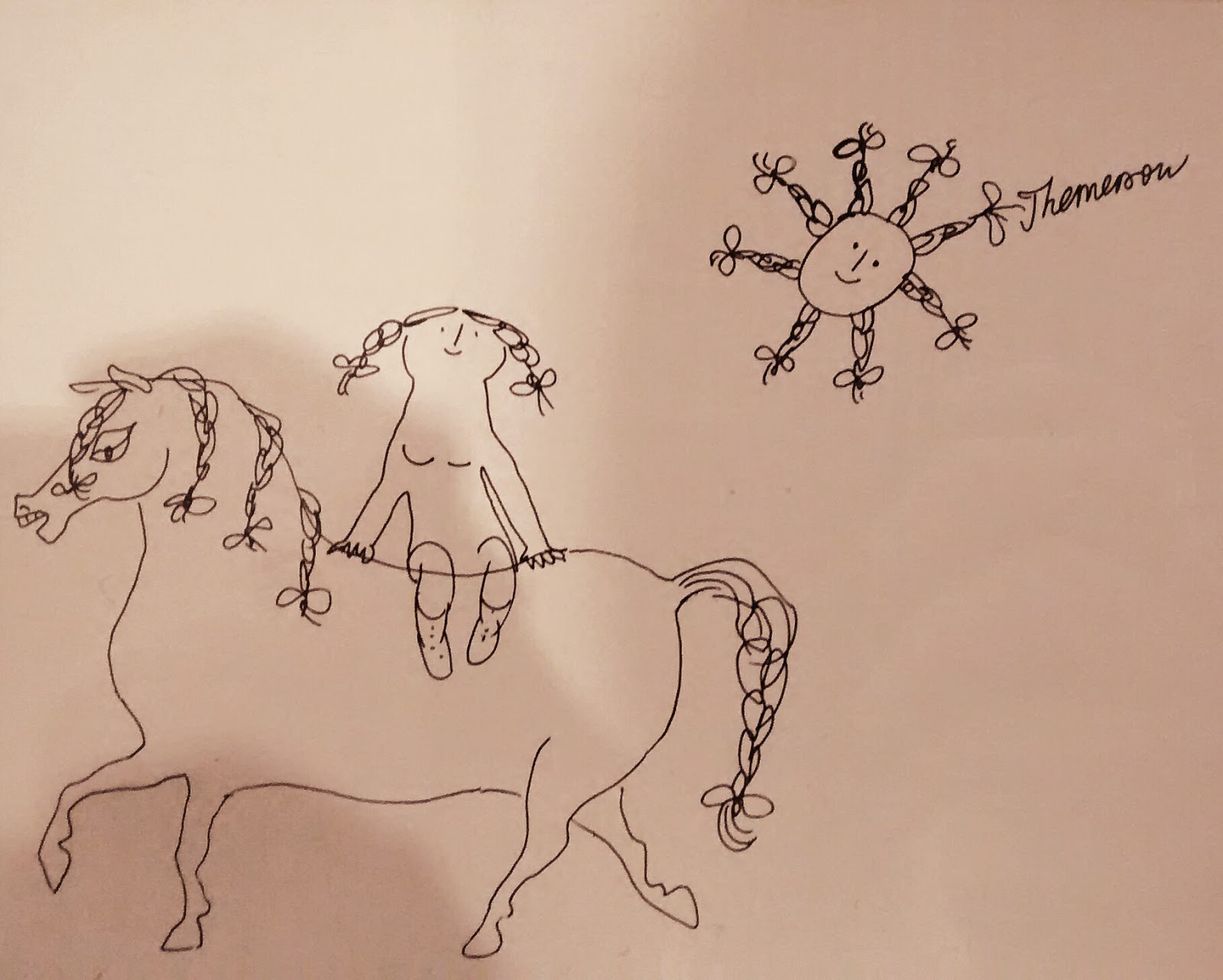
The resultant weekend consisted of some beautiful and interesting artwork (original illustrations for Alice in Wonderland, cardboard Themerson characters etc), some baffling (a pile of sand in the corner of a room entitled, Tonne??? Still getting my head round that one...), some unexpected Czech, Swedish and French friends, general architecture and market appreciation and a healthy dose of graffiti art.


The resultant weekend consisted of some beautiful and interesting artwork (original illustrations for Alice in Wonderland, cardboard Themerson characters etc), some baffling (a pile of sand in the corner of a room entitled, Tonne??? Still getting my head round that one...), some unexpected Czech, Swedish and French friends, general architecture and market appreciation and a healthy dose of graffiti art.
The Camden Arts Centre was possibly the best exhibition I attended over the weekend for it's collection of Themerson's illustrations, doodles, film and theatre work. I loved the playfulness of it all.
(Another post on the way soon about the illustrator/animator I befriended down in Elephant and Castle.)


Wednesday, 30 March 2016
Suivez Moi
So, during February I helped out a little on the creation of a music video for the debut album of a band called, Black Peaches. I was asked to help by Antony Barkworth-Knight, a local film-maker/director/animator who I'd worked with in the recent past. I created some 16mm film footage (beautiful old school stuff) with the help of my tutor, that Antony then transformed into the mesmeric flickers and shapes you see below, all timed to perfection with the music. He also threw in some birds I animated, and created cool symbols and characters with the painter Robin Megganity.
Great music and lovely animation by ABK.
http://www.brooklynvegan.com/black-peaches-released-debut-lp-and-suivez-moi-single-video-streams/
Great music and lovely animation by ABK.
http://www.brooklynvegan.com/black-peaches-released-debut-lp-and-suivez-moi-single-video-streams/
Drawing with Stitch
Even though animating with stitch is practically unheard of, drawing with stitch is nothing new. Cross-stitch, tapestry art, embroidery etc have always been ways of depicting images in textiles, rather than printing onto the surface of the fabric. (Bayeux Tapestry below)
 More modern examples of artists using stitch in their work are Tracey Emin...


 Artist, Caroline Schofield, who used it in her residency at Kilkenny Arts Office, in particular to depict one man called Christy, whom she drew in pencil and then rendered in stitch later.


I have also used stitch to draw in the past and found it rather freeing. It makes such beautiful, delicate illustrations as well, because it limits you and makes you more selective. It's very much like the old art foundation technique to loosen you up, continuous line drawing, but with added texture and unpredicatablity. Maybe it's the unpredictable nature of drawing with a sewing machine that has caused the only stitched animation I can find to be digitally embroidered, thereby avoiding that pitfall. I quite like the idea of a looser style though.

Tuesday, 29 March 2016
Stitched Up

Animation has been around for decades and is so prevalent now that I think it's important to play around with materials and reinvent their use in order to surprise people. I've always loved incorporating stitch into illustration (one day it might be nice to collaborate with a textiles artist to create some stitched designs, but that's a future project). Last year I created a stitched stop-motion set, featuring patchwork fields and fluffy clouds, and I really appreciate the miniature knitwear used in animations such as Coraline and The Clangers. There's something homely and recognisable in using stitching and fabrics within art.
The Whitworth recently had an exhibition featuring feminist artists, many of which use textiles and stitch as their medium of choice to tackle traditional notions of womanhood, craft and art. I'm obviously not tackling any of these issues in my moving image piece, but there was something really engaging about seeing cross-stich samples and quilts presented as art that has stuck with me.
I thought it would be a a nice touch to incorporate stitch into my frames, using the threads to add weight to lines and give the piece more texture. I think this will draw the viewer in more as well because it's a medium that is largely unexplored within animation. It's something most people won't have seen.
I've found some shakey-camera attempts at stop-motion with stitch on youtube, but in the professional field I could only find a handful of embroidered animations. The three of the professional examples I found have used digitised images put through as files to a digital embroidery machine. I would just be using my sewing machine to highlight certain linework in each frame, rather than stitching the whole image as is done in these examples. I love the blend of traditional and modern in the style of these embroidered animations, especially the zoetrope on a turntable; reinventing one of the earliest animated forms in a new and exciting way...
Thursday, 24 March 2016
American Illustration 32

 |
| These portraits are by Tina Berning and I liked them for their simplicity and the different marks she uses, ranging from loose inky washes, to cross-hatching, patterns, simple strong line work and blocks of black. I especially like the way Berning uses the lighter tones of the ink to achieve subtle shadows in the facial features, the tonality of each piece is very effective. |
 |
| I loved this whole spread for its playfulness. The artists have been set side by side purely by chance because of the alphabetical ordering of the book, but I think it works really nicely. Christopher Niemann's use of photography and real pencil shavings reminds me of Lord Whitney and the idea that illustration doesn't have to be flat 2D images on screen or paper. Even though it's simple, the emphasis is on the idea and the fun of the image. It does what I think good illustration should do and communicate without relying on words. Opposite, Nik Neves uses colour really boldly and I love the contrast between the green of the tree and the block reds and oranges of the buildings. |
 |
| This image is by Peter Oumanksi and I think I chose this for the flatness of the perspective and the fairly limited colour scheme; the pink and olive green work really well together against warm grey, and stop it becoming to heavy with the black outlines and high detailing. I definitely like the composition of this image, the blank space seems to allow for the dense detail and draws you in. Personally I know I would always be tempted to draw in some waves in that blank space, but they'd be unnecessary, the viewer knows it's water without them. Making me consider how much an image can be pared back. |
 |
| I adore Brian Rea, so obviously these images made my top ten from the journal. Again it's the genius behind the image that gets me, not necessarily the style (although I like that too). This one was for the Modern Love column, accompanying an article about a man faced with throwing the items of a shared home after his wife dies. You can feel the unwillingness and loneliness right from the offset just by the body language of the figure and the composition of the piece. The room looks empty even though it is full of possessions. Originally, I thought this might be about consumerism and how you can't find happiness in things, which isn't too far off. |
 |
| Brian Rea again, and again it's the reflective quality of the image that I love. You know immediately that this guy's only friend is his dog and that maybe he's struggling with a life direction from the simple clues in the illustration, such as their posture, the empty pizza box, the fallen cup... This was to accompany a Modern Love article about a man who's love for his dog helped him past his heartbreak, but you already knew that just by looking. |
 |
| I chose this image for its playful quality in the colour scheme and marks. Everything has a spontaneous feel in this illustration, including the composition, things are layered haphazardly and drawn over. It draws you in. |
  |
| This caught my eye because I'm really enjoying the trend over the last few years of a kind of rough, hand-drawn mark and coloured pencil texture, as opposed to digitally clean illustrations. The misty fading at the top of the image balances really well with the dark roofs at the bottom and I like the odd splash of mustard yellow against the grey. This A/W fashion collection has featured that palette quite strongly so it would be interesting to see if illustrations like this from 3 years ago fed that trend??? |
 |
| Another illustration that speaks with some comedy. This drawing style reminded me a lot of Quentin Blake because of the soft, scratchy line work and delicate watercolours, so it caught my eye. Then I realised it was actually quite comical as well and so it made the top ten for using a nice, traditional style that took me back to my childhood of books to remind me that social media is a bit of a black hole. |
Looking through my selection I can see a tendancy towards the hand-drawn, delicate or limited colour palettes and comedy in my picks. I guess I like illustration that is either easy on the eye or saying something interesting, but preferably both.
Wednesday, 23 March 2016
Gormley & Composition
If you ever feel stuck in a compositional rut, turn to a sculptor for help. I've found that there's something about people who think in terms of 3D space having a real knack for composition, and you can see it even in their small scale sketches and designs for their sculptures.
I've recently taken 'Body and Light', a book of drawings by sculptor Anthony Gormley, out of the library and it's full of these gorgeous, loose ink drawings that are really helping me think of the compositions of my moving image work. I've been viewing these images as though they were screenshots from a film, and imagining the immediate before and after movement that led to that particular drawing.
Activities like this help me to step away from my usual flat, straightforward scenes, and think more in terms of a 3D space, a moving camera and pacing/composition time-wise. In moving image work composition is more than just how you display a single image, it's also about the film environment the image is in; contrasts between sweeping panoramas and close-ups, fast-paced movement and energy against stillness...


Subscribe to:
Comments (Atom)